
Tips: Use <p>Your_paragraph_here</p> a tag to add paragraphs to the article.
- Writing Format for: Plus UI Themed v2.6.1 Template Updated on: Jun 1, 2022
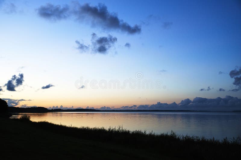
Plus UI 2.6.1 Image with Caption and Auto Lightbox
Added class='full' works to remove margin image and screen, only works for mobile view.
Plus UI 2.6.1 Writing Formats-1
<table class='tr-caption-container'>
  <tbody>
    <tr>
      <td>
        <img alt='image_title_here' class='full' src='https://4.bp.blogspot.com/.../name.png'/>
      </td>
    </tr>
    <tr>
      <td class='tr-caption'>Your_caption_is_here</td>
    </tr>
  </tbody>
</table>
Plus UI 2.6.1 Image with Grid Layout


Plus UI 2.6.1 Image Writing format:-1
<!--[ Grid Image ]-->
<div class='psImg grImg'>
  <img alt='image_title_here' src='https://4.bp.blogspot.com/.../name.png'/>
  <img alt='image_title_here' src='https://4.bp.blogspot.com/.../name.png'/>
  <img alt='image_title_here' src='https://4.bp.blogspot.com/.../name.png'/>
  <img alt='image_title_here' src='https://4.bp.blogspot.com/.../name.png'/>
</div>
Plus UI 2.6.1 Image with Show All Function
Used Plus UI 2.6.1 to hide some images and will be shown when the user clicks the 'Show All button. Show All function can only be activated once, Images cannot be hidden again when you activate it.


Plus UI 2.6.1 Image Writing format:-2
<!--[ Show All Image ]-->
<input class='inImg hidden' id='for-hideImage' type='checkbox'>
<div class='psImg hdImg'>
  <img alt='image_title_here' src='https://4.bp.blogspot.com/.../name.png'/>
  <img alt='image_title_here' src='https://4.bp.blogspot.com/.../name.png'/>
  <img alt='image_title_here' src='https://4.bp.blogspot.com/.../name.png'/>

  <div class='btImg'>
    <img alt='image_title_here' src='https://4.bp.blogspot.com/.../name.png'/>

    <!--[ Button image to activate ]-->
    <label for='for-hideImage' aria-label='Show all image'>Show All</label>
  </div>

  <!--[ Hide the rest image here ]-->
  <div class='psImg shImg'>
    <img alt='image_title_here' src='https://4.bp.blogspot.com/.../name.png'/>
    <img alt='image_title_here' src='https://4.bp.blogspot.com/.../name.png'/>
    <img alt='image_title_here' src='https://4.bp.blogspot.com/.../name.png'/>
    <img alt='image_title_here' src='https://4.bp.blogspot.com/.../name.png'/>
  </div>
</div>
Plus UI 2.6.1 Image with Scroll Layout
Same as the image layout above, it's just that on the mobile display the images will be arranged in parallel with the additional side scroll function on the mobile display.
We also added a smooth scroll effect to this feature. Please try opening this page on your mobile device:
Plus UI 2.6.1 Image Writing format:-3
<!--[ Scroll Image ]-->
<div class='psImg scImg scrlH'>
  <img alt='image_title_here' src='https://4.bp.blogspot.com/.../name.jpg'/>
  <img alt='image_title_here' src='https://4.bp.blogspot.com/.../name.jpg'/>
  <img alt='image_title_here' src='https://4.bp.blogspot.com/.../name.jpg'/>
  <img alt='image_title_here' src='https://4.bp.blogspot.com/.../name.jpg'/>
</div>
Plus UI 2.6.1 Lazyload Image
Useful for delaying loading images so that the blog's PageSpeed score is higher, the image will only load when the user scrolls to the image area. All images in this article use Lazyload.
Plus UI 2.6.1 Image Writing format:-4
<div>
  <img class='lazy' alt='image_title_here' data-src='https://4.bp.blogspot.com/.../name.png' src='data:image/png;base64,R0lGODlhAQABAAD/ACwAAAAAAQABAAACADs='/>
  <noscript><img alt='image_title_here' src='https://4.bp.blogspot.com/.../name.png'/></noscript>
</div>
Plus UI 2.6.1 Manual Related Post
It is important to note that this feature is written manually, it does not automatically appear on every page.
Plus UI 2.6.1 Writing format:
<div class='pRelate'>
  <!--[ Related title ]-->
  <b>You may want to read this post :</b>

  <ul>
    <li><a href='#'>Your_post_title_here</a></li>
    <li><a href='#'>Your_post_title_here</a></li>
    <li><a href='#'>Your_post_title_here</a></li>
  </ul>
</div>
Plus UI 2.6.1 Auto Related Post
Related Posts
Plus UI 2.6.1 Writing Format:
<details class='sp toc' open=''>
  <summary data-show='Show all' data-hide='Hide all'>Related Posts</summary>
  <div class='toC' id='aRel'></div>
</details>
Plus UI 2.6.1 Post Break
You can use this feature to separate paragraphs or to open a new chapter in a post, here's an example of how it looks:
Plus UI 2.6.1 Writing format:
<!--[ To break paragraphs apart ]-->
<hr>
Plus UI 2.6.1 Paragraph with Text Indent
Lorem ipsum dolor sit amet, consectetur adipiscing elit. Proin vestibulum dignissim diam, et efficitur felis commodo et. Mauris vel diam pellentesque lorem lacinia luctus.
Plus UI 2.6.1 Writing format:
<p class='pIndent'>Your_paragraph_is_here.</p>
Plus UI 2.6.1 Paragraph with Drop cap
Mis a large capital letter used as a decorative element at the beginning of a paragraph or section. The size of the descending limit is usually two or more lines.
The drop cap will resize the first letter of the paragraph so that it drops one or more lines down. Many types of print media use drop caps such as books, magazines, newspapers, and so on because they can add to the visual appeal.
Plus UI 2.6.1 Writing format:
<p><span class='dropCap'>Y</span>our_paragraph_is_here.</p>
Plus UI 2.6.1 Blockquote
Lorem ipsum dolor sit amet, consectetur adipiscing elit. Proin vestibulum dignissim diam, et efficitur felis commodo et. Mauris vel diam pellentesque lorem lacinia luctus.
— Anonymous
Plus UI 2.6.1 Writing format:
<blockquote>Lorem ipsum dolor sit amet, consectetur adipiscing elit. Proin vestibulum dignissim diam, et efficitur felis commodo et. Mauris vel diam pellentesque lorem lacinia luctus.</blockquote>
Another Style:
Lorem ipsum dolor sit amet, consectetur adipiscing elit. Proin vestibulum dignissim diam, et efficitur felis commodo et. Mauris vel diam pellentesque lorem lacinia luctus. Nulla quam magna, pharetra in ultrices at, condimentum id tellus.
- Sed suscipit sapien sed turpis ultrices viverra. Ut quis dui sed odio sollicitudin fermentum.
- Aliquam vitae metus laoreet, dapibus enim sit amet, feugiat lorem. Sed in dui purus.
Plus UI 2.6.1 Writing Format:
<blockquote class='s-1'>
  <div>Lorem ipsum dolor sit amet, consectetur adipiscing elit. Proin vestibulum dignissim diam, et efficitur felis commodo et. Mauris vel diam pellentesque lorem lacinia luctus. Nulla quam magna, pharetra in ultrices at, condimentum id tellus.
    <ul>
      <li>Sed suscipit sapien sed turpis ultrices viverra. Ut quis dui sed odio sollicitudin fermentum.</li>
      <li>Aliquam vitae metus laoreet, dapibus enim sit amet, feugiat lorem. Sed in dui purus.</li>
    </ul>
  </div>
</blockquote>
Plus UI 2.6.1 Social Blockquote
Lorem ipsum dolor sit amet, consectetur adipiscing elit. Proin vestibulum dignissim diam, et efficitur felis commodo et. Mauris vel diam pellentesque lorem lacinia luctus. Nulla quam magna, pharetra in ultrices at, condimentum id tellus.
Plus UI 2.6.1 Writing Format:
<blockquote class='pu_blq' data-author='Anonymous'>Lorem ipsum dolor sit amet, consectetur adipiscing elit. Proin vestibulum dignissim diam, et efficitur felis commodo et. Mauris vel diam pellentesque lorem lacinia luctus. Nulla quam magna, pharetra in ultrices at, condimentum id tellus.</blockquote>
Plus UI 2.6.1 Note Block
This feature serves to add important info, warning sentences or highlight sentences, there are two styles that you can try including:
Lorem ipsum dolor sit amet, consectetur adipiscing elit. Proin vestibulum dignissim diam, et efficitur felis commodo et.
<p class='note'>Lorem ipsum dolor sit amet, consectetur adipiscing elit. Proin vestibulum dignissim diam, et efficitur felis commodo et.</p>
With Different Colors:
Warning!Mauris vel diam pellentesque lorem lacinia luctus. Nulla quam magna, pharetra in ultrices at, condimentum id tellus. Sed suscipit sapien sed turpis ultrices viverra.
<p class='note wr'>Mauris vel diam pellentesque lorem lacinia luctus. Nulla quam magna, pharetra in ultrices at, condimentum id tellus. Sed suscipit sapien sed turpis ultrices viverra.</p>
Plus UI 2.6.1 Table
The table in this theme has been set responsive, for example, if the number of columns or the width of the table exceeds the width of the screen, so as not to damage the layout, the table will automatically have a scroll function.
Please open this article on your mobile device and highlight the table section below:
| Name | Position | Office | Age | Start date | Salary |
|---|---|---|---|---|---|
| Tiger Nixon | System Architect | Edinburgh | 61 | 2011/04/25 | $320,800 |
| Garrett Winters | Accountant | Tokyo | 63 | 2011/07/25 | $170,750 |
| Ashton Cox | Junior Technical Author | San Francisco | 66 | 2009/01/12 | $86,000 |
| Cedric Kelly | Senior Javascript Developer | Edinburgh | 22 | 2012/03/29 | $433,060 |
| Airi Satou | Accountant | Tokyo | 33 | 2008/11/28 | $162,700 |
Writing format:
<div class='table'>
  <table style='white-space:nowrap; min-width:100%;'>
    <thead>
      <tr>
        <th>Name</th>
        <th>Position</th>
        <th>Office</th>
        <th>Age</th>
        <th>Start date</th>
        <th>Salary</th>
      </tr>
    </thead>
    <tbody>
      <tr>
        <td>Tiger Nixon</td>
        <td>System Architect</td>
        <td>Edinburgh</td>
        <td>61</td>
        <td>2011/04/25</td>
        <td>$320,800</td>
      </tr>
      <tr>
        <td>Garrett Winters</td>
        <td>Accountant</td>
        <td>Tokyo</td>
        <td>63</td>
        <td>2011/07/25</td>
        <td>$170,750</td>
      </tr>
      <tr>
        <td>Ashton Cox</td>
        <td>Junior Technical Author</td>
        <td>San Francisco</td>
        <td>66</td>
        <td>2009/01/12</td>
        <td>$86,000</td>
      </tr>
      <tr>
        <td>Cedric Kelly</td>
        <td>Senior Javascript Developer</td>
        <td>Edinburgh</td>
        <td>22</td>
        <td>2012/03/29</td>
        <td>$433,060</td>
      </tr>
      <tr>
        <td>Airi Satou</td>
        <td>Accountant</td>
        <td>Tokyo</td>
        <td>33</td>
        <td>2008/11/28</td>
        <td>$162,700</td>
      </tr>
    </tbody>
  </table>
</div>
white-space:nowrap;specifies the text to be a single line, it will not wrap to the next line and will continue until<br>the tag is encountered.min-width:100%;defines the minimum width of the table, you can change it to px units for example500px. Change it0if you want the table width to be determined automatically.
Plus UI 2.6.1 Manual Table of Content
Contents
Using a manual Table of Content is more complicated than the automatic version, you have to add a different ID attribute in each heading tag and write it in the content list.
This is an example of a heading tag with a custom ID:
<h2>Your_Heading</h2>

<h3>Sub_Heading_1</h3>
<h2 id='heading'>Your_Heading</h2>

<h3 id='subHeading'>Sub_Heading_1</h3>
Writing format:
<details class='sp toc' open=''>
  <summary data-show='Show all' data-hide='Hide all'>Contents</summary>
  <div class='toC'>
    <ol>
      <li><a href='#heading'>Your_Heading</a></li>
      ...
      ...
      ...
    </ol>

    <!--[ Sample ToC with subheading ]-->
    <ol>
      <li><a href='#heading'>Your_Heading</a>
        <ol>
          <li><a href='#subHeading'>Sub_Heading_1</a></li>
          ...
          ...
          ...
        </ol>
      </li>
    </ol>
  </div>
</details>
- Remove
open=''attribute to auto-close Table of Content when the page is first loaded. - You can change the title or phrase 'Show all/Hide all' in the marked section.
Plus UI 2.6.1 Semi Automatic Table of Content
Table of Contents
- Image with Caption and Auto Lightbox
- Image with Grid Layout
- Image with Show All Function
- Image with Scroll Layout
- Lazyload Image
- Manual Related Post
- Auto Related Post
- Post Break
- Paragraph with Text Indent
- Paragraph with Drop cap
- Blockquote
- Note Block
- Table
- Manual Table of Content
- Semi Automatic Table of Content
- Syntax Highlighter
- Multi Functional Syntax Highlighter
- MultiTabs Syntax Highlighter
- Toggle Show / Hide
- Toggle Content or Accordion
- External Link
- Button Link
- Download Link
- Countdown Download Box
- Music Player
- Lazy YouTube Video
- Post Reference
- Header Subtitle
- Previous or Next Post
The easiest option is to display the Table of Content. This feature will display all heading tags in your post (three levels h2 - h4), so make sure you write heading tags in order. Read: Common Error
Code to specify semi-automatic ToC widget location:
<details class='sp toc'>
  <summary data-show='Show all' data-hide='Hide all'>Table of Contents</summary>
  <div class='toC' id='autoToc'></div>
</details>
Plus UI 2.6.1 Syntax Highlighter
Used to define lines of computer code (HTML, CSS, Javascript, etc.) in posts.
<!--[ Change data-text to .html, .css, .js or any language ]-->
<div class='pre notranslate' data-text='.html'>
  <pre style='white-space:pre-wrap; max-height:none;'>Your_code_is_here</pre>
</div>
The addition of color code in the syntax can be written manually, but we also provide automatic colored syntax features.
- Change
data-text='.html'to define another code format, i.e.data-text='.css',data-text='.js',data-text='.php', etc - Value
white-space:pre-wrap;useful for disabling side-scrolling, long code will be preserved and give a little scrolling function to keep it legible. max-height:none;defines the maximum height of syntax isn't set (automatic), change the value ofnoneto eg400pxto specify the maximum height of syntax is only 400 pixels.- Use
<i class='red'>code_here</i>to add red/orange color. - Use
<i class='blue'>code_here</i>to add blue color. - Use
<i class='green'>code_here</i>to add green color. - Use
<i class='gray'>code_here</i>to add gray color. - Use
<i class='block'>code_here</i>to add a block of blue color.
Plus UI 2.6.1 Automatic Colored Syntax Highlighter
Following Syntax is automatically highlighted/colored using Highlight.js
<html dir='ltr' lang='en'> <head> <title>Sample Page</title> </head> <!--[ <body> open ]--> <body> <p>Sample content here!</p> </body> <!--[ </body> close ]--> </html>
Code to color syntax:
<!--[ Add a classname hl to automatically color syntax ]--> <div class='pre hl notranslate' data-text='.html'> <pre style='white-space:pre-wrap; max-height:none;'>Your_code_is_here</pre> </div>
Common Errors:
This feature automatically detects the language and highlights the colors. But in some cases, it may not automatically detect the code language, at that time you have to add a class name as per the language, i.e. if it is HTML, you have to add html or language-html along with hl.
An Example:
<!--[ Add a classname hl to automatically color syntax ]--> <div class='pre hl language-javascript notranslate' data-text='.js'> <pre style='white-space:pre-wrap; max-height:none;'>Your_code_is_here</pre> </div>
Limitations of using Automatic Colored Syntax Highlighter:
- You cannot add any tag in your Preformatted Codes. For example, you would add
<i class='block'></i>, that is no more going to be blocked with blue color.
Plus UI 2.6.1 Multi Functional Syntax Highlighter
Your_code_is_here
Writing Format:
<!--[ Replace data-text with any name to show, data-file with filename, data-lang with file extension, data-time with countdown in seconds ]--> <div class='pre pu notranslate' data-time='5' data-text='Codebox Writing Format' data-file='Typography Codebox' data-lang='.html'> <pre style='white-space:pre-wrap; max-height:none;'>Your_code_is_here</pre> </div>
Plus UI 2.6.1 MultiTabs Syntax Highlighter
<!DOCTYPE html>
<html dir='ltr' lang='en'>
  <head>
    <title>Sample Page</title>
  </head>

  <!--[ <body> open ]-->
  <body>
    <p>Sample content here!</p>
  </body>
  <!--[ </body> close ]-->
</html>
/* Standar CSS */
::selection{color:#fff;background:var(--linkC)}
*, ::after, ::before{-webkit-box-sizing:border-box;box-sizing:border-box}
h1, h2, h3, h4, h5, h6{margin:0;font-weight:700;font-family:var(--fontH);color:var(--headC)}
h1{font-size:1.9rem}
h2{font-size:1.7rem}
h3{font-size:1.5rem}
h4{font-size:1.4rem}
h5{font-size:1.3rem}
h6{font-size:1.2rem}
a{color:var(--linkC);text-decoration:none}
a:hover{opacity:.9;transition:opacity .1s}
{
  "@context": "https://schema.org",
  "@type": "WebSite",
  "url": "https://plus-ui.fineshopdesign.com/",
  "name": "Plus UI",
  "alternateName": "Plus UI",
  "potentialAction": {
    "@type": "SearchAction",
    "target": "https://plus-ui.fineshopdesign.com/search?q={search_term_string}",
    "query-input": "required name=search_term_string"
  }
}
Plus UI 2.6.1 Writing Code:
<div class='pre tb'>
  <!--[ Active function ]-->
  <input class='prei hidden' id='preT-1' type='radio' name='preTab' checked>
  <input class='prei hidden' id='preT-2' type='radio' name='preTab'>
  <input class='prei hidden' id='preT-3' type='radio' name='preTab'>
  <!--[ Header/title ]-->
  <div class='preH tbHd scrlH'>
    <!--[ Change atribute data-text='...' to replace title ]-->
    <label for='preT-1' data-text='HTML'></label>
    <label for='preT-2' data-text='CSS'></label>
    <label for='preT-3' data-text='JS'></label>
  </div>

  <!--[ Content ]-->
  <div class='preC-1'>
    <pre>Your_code_is_here</pre>
  </div>
  <div class='preC-2'>
    <pre>Your_code_is_here</pre>
  </div>
  <div class='preC-3'>
    <pre>Your_code_is_here</pre>
  </div>
</div>
- The
checkedan attribute defines the first tab that appears by default. - Make sure
id='...'andfor='...'attributes have the same value. ID must be unique, there cannot be two identical IDs on one page. - Change
data-text='HTML'attribute in the highlighted section to rename the tab.
Plus UI 2.6.1 Toggle Show / Hide
Used to create interactive widgets that the user can open and close on demand. By default this widget is closed and will display the content in it when the user presses the command button.
Any content can be included in this widget.
Spoiler:
Epcot is a theme park at Walt Disney World Resort featuring exciting attractions, international pavilions, award-winning fireworks and seasonal special events.
<details class='sp'>
  <summary data-show='Show all' data-hide='Hide all'>Spoiler:</summary>
  <p>Your_text_is_here.</p>
</details>
Plus UI 2.6.1 Toggle Content or Accordion
Defines additional content that users can open and close on demand in groups, usually used for a list of questions or FAQs (Frequently Asked Questions).
Accordion_first_title
Epcot is a theme park at Walt Disney World Resort featuring exciting attractions, international pavilions, award-winning fireworks and seasonal special events.
Accordion_second_title
Epcot is a theme park at Walt Disney World Resort featuring exciting attractions, international pavilions, award-winning fireworks and seasonal special events.
Accordion_third_title
Epcot is a theme park at Walt Disney World Resort featuring exciting attractions, international pavilions, award-winning fireworks and seasonal special events.
Accordion_forth_title
Epcot is a theme park at Walt Disney World Resort featuring exciting attractions, international pavilions, award-winning fireworks and seasonal special events.
<!--[ Accordion start ]-->
<div class='showH'>
  <!--[ Accordion line 1 ]-->
  <details class='ac'>
    <summary>Title_is_here</summary>
    <div class='aC'>
      <p>Your_text_is_here.</p>
    </div>
  </details>

  <!--[ Accordion line 2 ]-->
  <details class='ac alt'>
    <summary>Title_is_here</summary>
    <div class='aC'>
      <p>Your_text_is_here.</p>
    </div>
  </details>

  ...

  ...
</div>
- Use the class name
alt(marked in the code above) to change the icon style. - The number of accordion widgets you can add is unlimited.
Plus UI 2.6.1 FAQ schema in Microdata
<!--[ Accordion start ]-->
<div class='showH' itemscope='' itemtype='https://schema.org/FAQPage'>
  <!--[ Accordion line 1 ]-->
  <details class='ac' itemscope='' itemprop='mainEntity' itemtype='https://schema.org/Question'>
    <summary itemprop='name'>Title_is_here</summary>
    <div class='aC' itemscope='' itemprop='acceptedAnswer' itemtype='https://schema.org/Answer'>
      <p itemprop='text'>Your_text_is_here.</p>
    </div>
  </details>

  <!--[ Accordion line 2 ]-->
  <details class='ac alt' itemscope='' itemprop='mainEntity' itemtype='https://schema.org/Question'>
    <summary itemprop='name'>Title_is_here</summary>
    <div class='aC' itemscope='' itemprop='acceptedAnswer' itemtype='https://schema.org/Answer'>
      <p itemprop='text'>Your_text_is_here.</p>
    </div>
  </details>

  ...

  ...
</div>
Plus UI 2.6.1 External Link
Notifies users if the link will lead to another site.
Sample_external_linkSample_link_alt
<a class='extL' href='#' rel='noreferrer' target='_blank'>Sample_external_link</a>
<a class='extL alt' href='#' rel='noreferrer' target='_blank'>Sample_link_alt</a>
Plus UI 2.6.1 Button Link
Button<a class='button' href='url_is_here'>Title_link</a>
Alternative style:
Button<a class='button ln' href='url_is_here'>Title_link</a>
With icons:
DownloadDemo
<a class='button' href='url_is_here'><i class='icon dl'></i>Title_link</a>
<a class='button' href='url_is_here'><i class='icon demo'></i>Title_link</a>
with <svg> icons:
Buy now!
<a class='button' href='url_is_here'>
  <svg viewBox='0 0 64 64' style='fill:#fff; margin-right:12px;'><path d='M6.9,48.4c-0.4,1.5-0.8,3.3-1.3,5.2c-0.7,2.9,1.9,5.6,4.8,4.8l5.1-1.3c1.7-0.4,3.5-0.2,5.1,0.5 c4.7,2.1,10,3,15.6,2.1c12.3-1.9,22-11.9,23.5-24.2C62,17.3,46.7,2,28.5,4.2C16.2,5.7,6.2,15.5,4.3,27.8c-0.8,5.6,0,10.9,2.1,15.6 C7.1,44.9,7.3,46.7,6.9,48.4z M21.3,19.8c0.6-0.5,1.4-0.9,1.8-0.9s2.3-0.2,2.9,1.2c0.6,1.4,2,4.7,2.1,5.1c0.2,0.3,0.3,0.7,0.1,1.2 c-0.2,0.5-0.3,0.7-0.7,1.1c-0.3,0.4-0.7,0.9-1,1.2c-0.3,0.3-0.7,0.7-0.3,1.4c0.4,0.7,1.8,2.9,3.8,4.7c2.6,2.3,4.9,3,5.5,3.4 c0.7,0.3,1.1,0.3,1.5-0.2c0.4-0.5,1.7-2,2.2-2.7c0.5-0.7,0.9-0.6,1.6-0.3c0.6,0.2,4,1.9,4.7,2.2c0.7,0.3,1.1,0.5,1.3,0.8 c0.2,0.3,0.2,1.7-0.4,3.2c-0.6,1.6-2.1,3.1-3.2,3.5c-1.3,0.5-2.8,0.7-9.3-1.9c-7-2.8-11.8-9.8-12.1-10.3c-0.3-0.5-2.8-3.7-2.8-7.1 C18.9,22.1,20.7,20.4,21.3,19.8z'/></svg>
  <span>WhatsApp me!</span>
</a>
<a class='button' href='url_is_here'>
  <svg class='line' viewBox='0 0 24 24' style='stroke:#fff; margin-right:12px;'><g transform='translate(2.000000, 2.500000)'><path d='M0.7501,0.7499 L2.8301,1.1099 L3.7931,12.5829 C3.8701,13.5199 4.6531,14.2389 5.5931,14.2359094 L16.5021,14.2359094 C17.3991,14.2379 18.1601,13.5779 18.2871,12.6899 L19.2361,6.1319 C19.3421,5.3989 18.8331,4.7189 18.1011,4.6129 C18.0371,4.6039 3.1641,4.5989 3.1641,4.5989'></path><line x1='12.1251' y1='8.2948' x2='14.8981' y2='8.2948'></line><path d='M5.1544,17.7025 C5.4554,17.7025 5.6984,17.9465 5.6984,18.2465 C5.6984,18.5475 5.4554,18.7915 5.1544,18.7915 C4.8534,18.7915 4.6104,18.5475 4.6104,18.2465 C4.6104,17.9465 4.8534,17.7025 5.1544,17.7025 Z'></path><path d='M16.4347,17.7025 C16.7357,17.7025 16.9797,17.9465 16.9797,18.2465 C16.9797,18.5475 16.7357,18.7915 16.4347,18.7915 C16.1337,18.7915 15.8907,18.5475 15.8907,18.2465 C15.8907,17.9465 16.1337,17.7025 16.4347,17.7025 Z'></path></g></svg>
  <span>Buy now!</span>
</a>
Add style='fill:#fff; margin-right:12px;' or style='stroke:#fff; margin-right:12px;' attribute to give SVG icon a white color.
Two buttons in a single line:
<div class='btnF'>
  <a class='button ln' href='url_is_here'>Demo</a>
  <a class='button' href='url_is_here'><i class='icon dl'></i>Download</a>
</div>
Plus UI 2.6.1 Download Link
To provide downloaded file information to users.
<div class='dlBox'>
  <!--[ Change data-text='...' atribute to add new file type ]-->
  <span class='fT' data-text='zip'></span>
  <div class='fN'>
    <!--[ File name ]-->
    <span>file_name.zip</span>
    <span class='fS'>200kb</span>
  </div>

  <!--[ Download link (change href='...' atribute to add link download) ]-->
  <a class='button' aria-label='Download' href='url_is_here' rel='noreferrer' target='_blank'><i class='icon dl'></i></a>
</div>
With background image instead of text:
<div class='dlBox'>
  <!--[ Change data-text='...' atribute to add new file type ]-->
  <span class='fT lazy' data-text='zip' data-style='background-image: url(//3.bp.blogspot.com/.../title.png)'></span>
  <div class='fN'>
    <!--[ File name ]-->
    <span>about_me.png</span>
    <span class='fS'>10kb</span>
  </div>

  <!--[ Download link (change href='...' atribute to add link download) ]-->
  <a class='button' aria-label='Download' href='url_is_here' rel='noreferrer' target='_blank'><i class='icon dl'></i></a>
</div>
Plus UI 2.6.1 Countdown Download Box
This feature will show a countdown before the user downloads any file.
This feature requires a direct download link of cloud files. You can use Google Drive to get a direct download link to a file.
With Image:
Without Image:
Writing format:
<div class='dldCo' id='download1'>
  <div class='dldBx'>
    <div class='dldTp'>
      <div class='dldIm' data-text='.png' style='background-image:url(image_url_here)'>
        <svg class='dldSv' viewBox='0 0 34 34'>
          <circle class='b' cx='17' cy='17' r='15.92' />
          <circle class='c dldPg' cx='17' cy='17' r='15.92' />
        </svg>
      </div>
      <div class='dldIn'>
        <span data-text='Name'>Music_Wallpaper.png</span>
        <span data-text='Category'>Music</span>
        <span data-text='Size'>3.05MB</span>
        <span data-text='Resolution'>1920×1080</span>
        <span data-text='Extension'>.png</span>
      </div>
    </div>
    <button onclick='download("#", "10", "false", "#download1")' class='dldBt dldDl'><svg class='line' viewBox='0 0 24 24'><polyline points='8 17 12 21 16 17'/><line x1='12' x2='12' y1='12' y2='21'/><path d='M20.88 18.09A5 5 0 0 0 18 9h-1.26A8 8 0 1 0 3 16.29'/></svg></button>
    <button class='dldBt dldRt'><svg class='line' viewBox='0 0 24 24'><polyline points='23 4 23 10 17 10'/><path d='M20.49 15a9 9 0 1 1-2.12-9.36L23 10'/></svg></button>
  </div>
  <div class='dldSl'>
    <div class='dldMe'></div>
  </div>
</div>
Plus UI 2.6.1 Music Player
Music Player that can be used to play songs using audio files, i.e. MP3.
Plus UI 2.6.1 Writing format:
<div id='musicPlayer'></div>
<script>
  /*<![CDATA[*/
  /* Music Player Tracks */
  var playerTracks = [{
      name: "Track_title_here",
      artist: "Artist_names_here",
      cover: "https://raw.githubusercontent.com/.../name.jpg",
      source: "https://raw.githubusercontent.com/.../name.mp3"
    },
    {
      name: "Track_title_here",
      artist: "Artist_names_here",
      cover: "https://raw.githubusercontent.com/.../name.jpg",
      source: "https://raw.githubusercontent.com/.../name.mp3"
    },
    {
      name: "Track_title_here",
      artist: "Artist_names_here",
      cover: "https://raw.githubusercontent.com/.../name.jpg",
      source: "https://raw.githubusercontent.com/.../name.mp3"
    },
    {
      name: "Track_title_here",
      artist: "Artist_names_here",
      cover: "https://raw.githubusercontent.com/.../name.jpg",
      source: "https://raw.githubusercontent.com/.../name.mp3"
    }
  ];
  /*]]>*/
</script>
Plus UI 2.6.1 Lazy YouTube Video
Useful to delay loading Youtube videos after user scrolls the page.
<!--[ Lazy youtube ]-->
<div class='ytShdw'>
  <div class='lazyYt' data-embed='Youtube_video_ID'>
    <div class='play'>
      <svg viewbox='0 0 213.7 213.7'><polygon class='t' points='73.5,62.5 148.5,105.8 73.5,149.1'></polygon><circle class='c' cx='106.8' cy='106.8' r='103.3'></circle></svg>
    </div>
  </div>
</div>
Delaying iframe loading with defer.js function:
<!--[ Lazysize iframe ]-->
<div class='ytShdw'>
  <div class='videoYt'>
    <iframe title='Lazy Iframe' class='lazy' data-src='//www.youtube.com/embed/xxxxxxxxxxx' allow='accelerometer; autoplay; clipboard-write; encrypted-media; gyroscope; picture-in-picture' allowfullscreen></iframe>
  </div>
</div>
- Change the section marked with the ID Youtube video you want to display.
- The video ID can be found in the Youtube video URL, for example:
youtube.com/watch?v=axRAL0BXNvw.
Plus UI 2.6.1 Post Reference
To write a list of references or footnotes below the post
Source:
www.example.com
<p class='pRef'>Source:<br> www.example.com</p>
Plus UI 2.6.1 Header Subtitle
To change Header Subtitle in a particular post or page.
<style>/*<![CDATA[*/
  /* To change Header Subtitle */
  .headH .headSub{max-width:none}
  .headH .headSub::before{content:"Typography"}
/*]]>*/</style>
Plus UI 2.6.1 Previous or Next Post
Now Automated.